How Wayfinding Signs Took Shape Through Shared Conventions
See how wayfinding signs took shape through shared conventions, and learn why a clear mix of words, arrows, symbols, and placement helps people choose confidently.
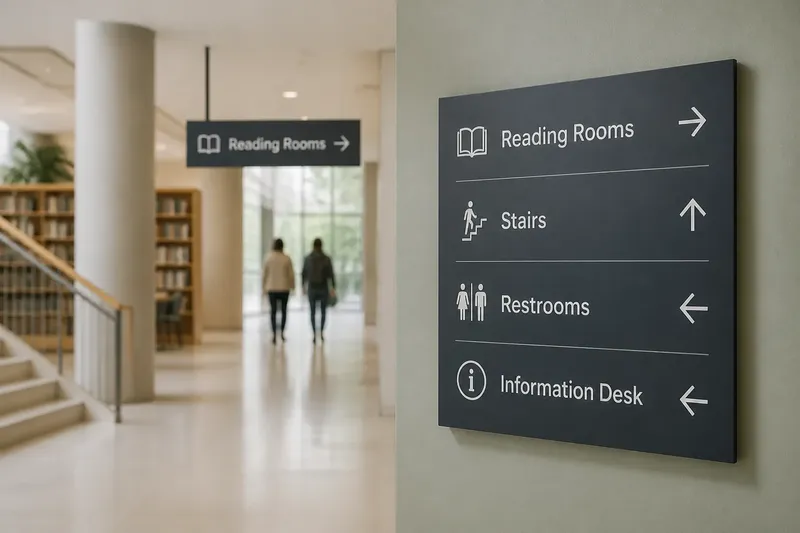
Wayfinding signs took shape around a practical problem: people needed to make choices in places they did not know. The answer was not simply to replace written directions with icons, but to make names, arrows, and symbols work together in a recognizable system.
That development is easier to understand through the decisions signs support than through a sweeping history. At a station entrance, for example, a traveler needs to identify the right platform before reaching the stairs. A useful sign connects a destination name to a direction while there is still time to act.
From Instructions To Systems
A spoken direction can be tailored to one person: turn after the bakery, then ask at the corner. A public sign has a different job. It must give many people a usable cue without knowing their language, destination, or familiarity with the place.
As public routes and buildings grew more complex, a collection of unrelated notices became harder to use. Sign systems addressed that problem by repeating a small set of conventions. The historical shift was gradual and varied by place; it was not one universal moment when words gave way to pictures.
Modern wayfinding still depends on words. Destination names distinguish places that might share a symbol, while short labels clarify what a pictogram represents. Arrows then connect that information to a choice in the surrounding space.
Conventions People Learn
A convention becomes useful when travelers encounter it consistently. If the same symbol marks restrooms across a building, people can recognize it without rereading a long explanation. If an arrow has one clear relationship to the route, it is easier to act on than an arrow whose meaning changes from sign to sign.
These conventions are not automatically understood by everyone. A symbol can be unfamiliar, a color can be hard to distinguish, and a word can be unclear to someone who does not speak the local language. Pairing cues gives people more than one way to interpret a sign.
Color can distinguish a named route, but it should not carry the whole message. A route label, a repeated line symbol, and a directional arrow provide other clues if the color is ambiguous or difficult to see. The same principle applies to pictograms: keep a concise label where the symbol could be mistaken for another service.
Placement And Sequence
A clear sign can fail if it appears after the decision point. At a fork, travelers need the direction before choosing a branch; farther along, a confirming sign can show that the route continues as expected.
Signs also work as a sequence. An overview map can establish destination names, a directional sign can guide a turn, and a confirmation sign can reassure someone after the turn. Putting every possible detail on each sign obscures the cue needed at that moment.
Imagine a visitor entering a public library whose two corridors split just beyond the lobby. The visitor wants the reading rooms, and the hypothetical building uses a sign at the lobby with that name and a right-pointing arrow. At the split, a matching label and arrow appear on the right branch; the visitor can follow the same cue without stopping to ask which corridor leads there. If the second sign instead points left, the route’s directions conflict, and the system needs correction before adding more signs.
What Do Sign Conventions Do?
Why combine words and symbols?
A symbol can be quick to recognize, while a word can specify exactly which service or destination it means. Together, they reduce the chance that a traveler will mistake a nearby feature for the intended one.
Can color guide a route by itself?
Color can help people distinguish routes when its use stays consistent. Pair it with a route name, symbol, or arrow so that the direction remains legible when color alone is not.
When should a sign appear?
Place directional information before a traveler must choose a path. A confirming sign after the choice helps show that the route continues in the expected direction.
How many symbols should a system use?
Use symbols for recurring needs that people can learn, and label them when their meaning might be unclear. A new icon for every local feature adds interpretation work without necessarily making a route easier to follow.
Consistency Without Clutter
Consistency does not mean putting the same message everywhere. A station entrance, a corridor split, and a platform need different information because each presents a different decision. Repeating the visual rules matters more than repeating every destination on every surface.
Not every wall needs an arrow, and inventing a symbol for every minor feature is not worth the effort. Those additions can compete with the signs that guide real route choices. A modest visual vocabulary, used in the right places, is easier to recognize and maintain.
For someone assessing a confusing route, check the system in sequence: does the sign name the intended destination, does its arrow match the available path, and does the next sign confirm the same route? If any answer is no, the decision is clear: correct the conflicting or missing cue before adding decoration or extra symbols.
Wayfinding signs took shape as shared agreements about how to connect a place name to a direction. When those agreements stay steady from one decision point to the next, a visitor does not need to know the building’s history or local shorthand to make the next choice.